


Sofia Airport
FIDS Redesign
A scalable flight-information system built for fast scanning, accessibility, and operational change.

Operational UX
Accessibility
Digital Signage
Role: Product Designer, FIDS UX/UI System
Delivery Partner: SITA
Timeline: 12 Months
Tools used:

Figma

Illustrator

Photoshop

Teams
A scalable screen system that improves readability, reduces confusion, and stays consistent under live operational changes.
Sofia Airport
FIDS Redesign
A scalable flight-information system built for fast scanning, accessibility, and operational change.
Operational UX
Accessibility
Digital Signage
Role: Product Designer, FIDS UX/UI System
Delivery Partner: SITA
Timeline: 12 Months
Tools used:
Figma
Illustrator
Photoshop
Teams
A scalable screen system that improves readability, reduces confusion, and stays consistent under live operational changes.
At a Glance
Sofia Airport’s FIDS is a real-time operational product. It must stay readable at distance, handle frequent changes, and remain consistent across multiple screen formats and locations.
Key journeys: Departures • Arrivals • Wayfinding to gate • Check-in • Baggage reclaim
CHALLENGE
The previous FIDS screens were hard to scan at distance, inconsistent across formats, and not optimized for peak-time decision making. Limited hierarchy and uneven spacing made critical information easy to miss, especially during delays, gate changes, and mixed terminal flows.
RESULT
I designed a unified FIDS UX/UI system with clear information hierarchy, accessibility-first typography, and layout rules that scale across all screen types. The system was built to support live data, airline branding constraints, and operational messages while staying consistent across terminals and zones.
APPROACH
Improved scanability and comprehension at a glance. Faster passenger orientation during disruptions. A consistent, future-ready screen language that can scale to new formats and Terminal 3 requirements.
CREDIBILITY
Certified by SITA as Product Designer for the concept and UX/UI design of Sofia Airport’s new FIDS screens.
View CertificateSignature features shipped
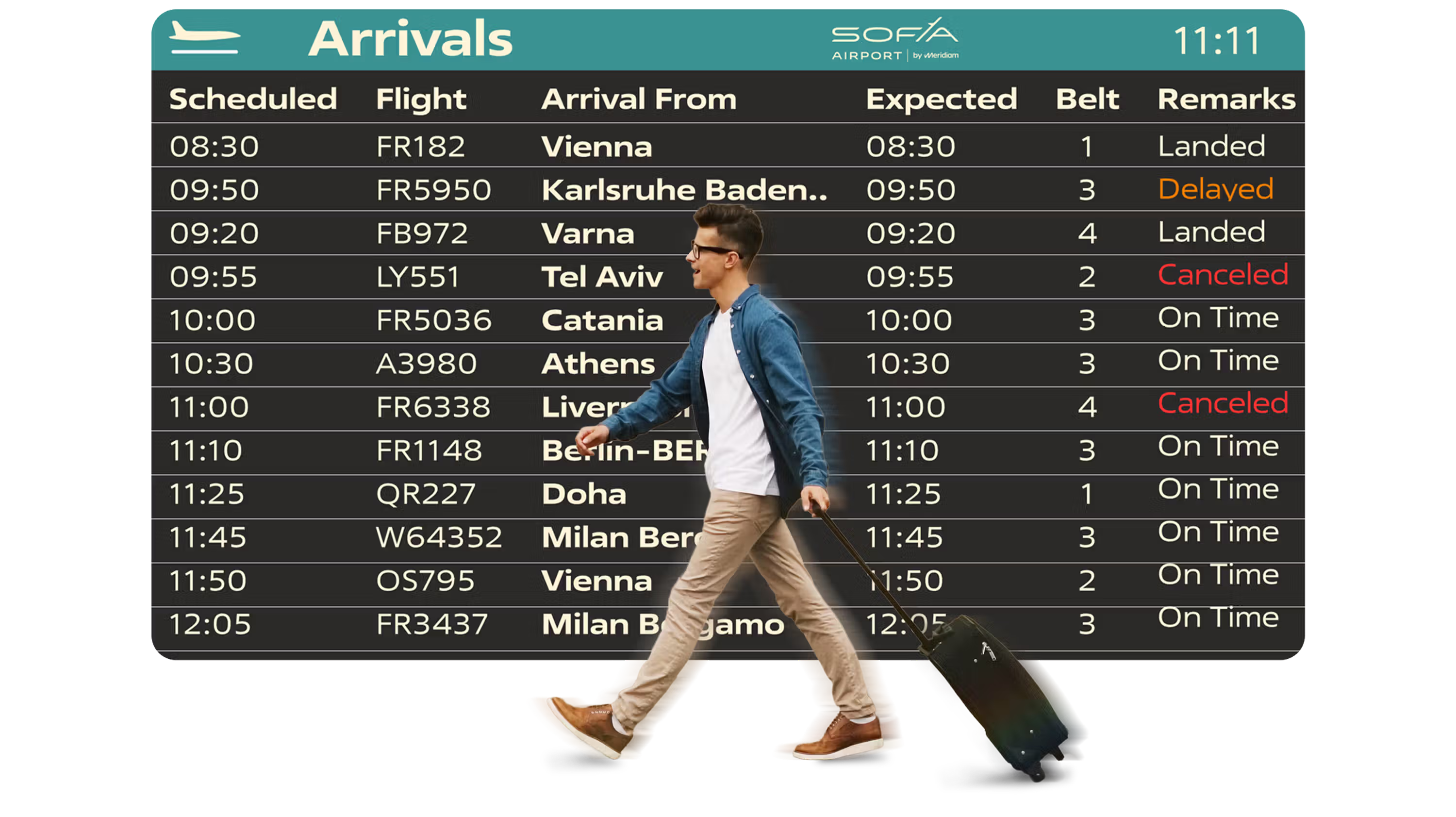
At-a-Glance Hierarchy
Scan-friendly hierarchy for fast decisions at distance.
• Primary focus on Destination and Status for instant decisions
• Column rhythm and spacing optimized for distance reading
• Clear separation between scheduled and expected times when needed
Why it matters: Reduces hesitation and wrong turns when time is tight.
Status-First Communication
Status is readable in a split second, even in motion.
• High-contrast status labels with consistent placement
• Color supports meaning, text carries the message
• Safe for color-vision deficiencies and glare conditions
Why it matters: Helps passengers react faster during delays and disruptions.
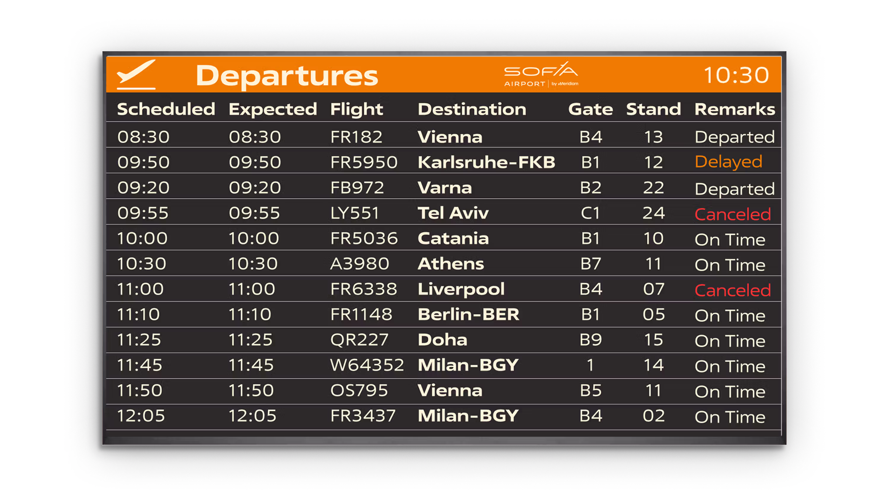
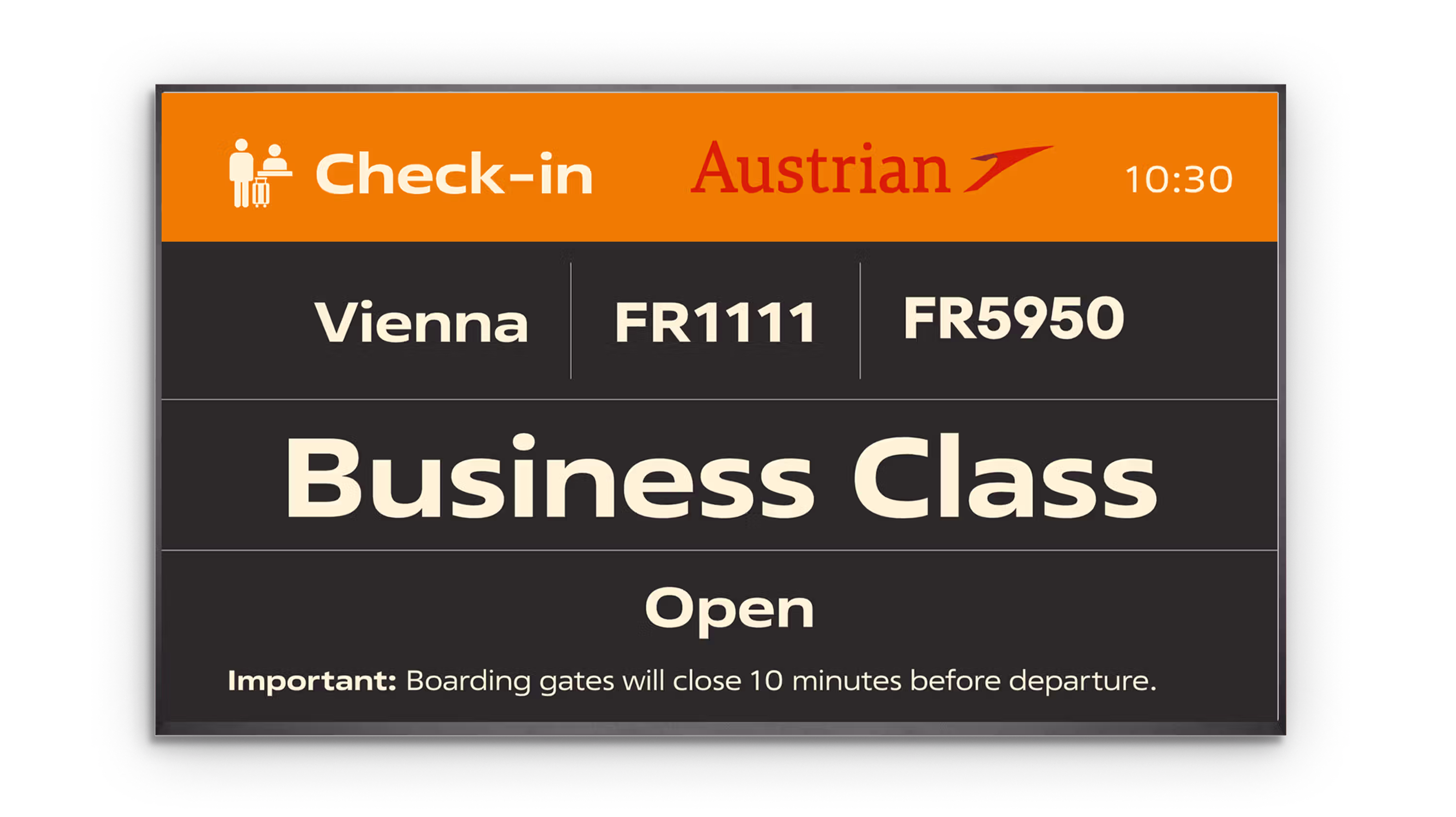
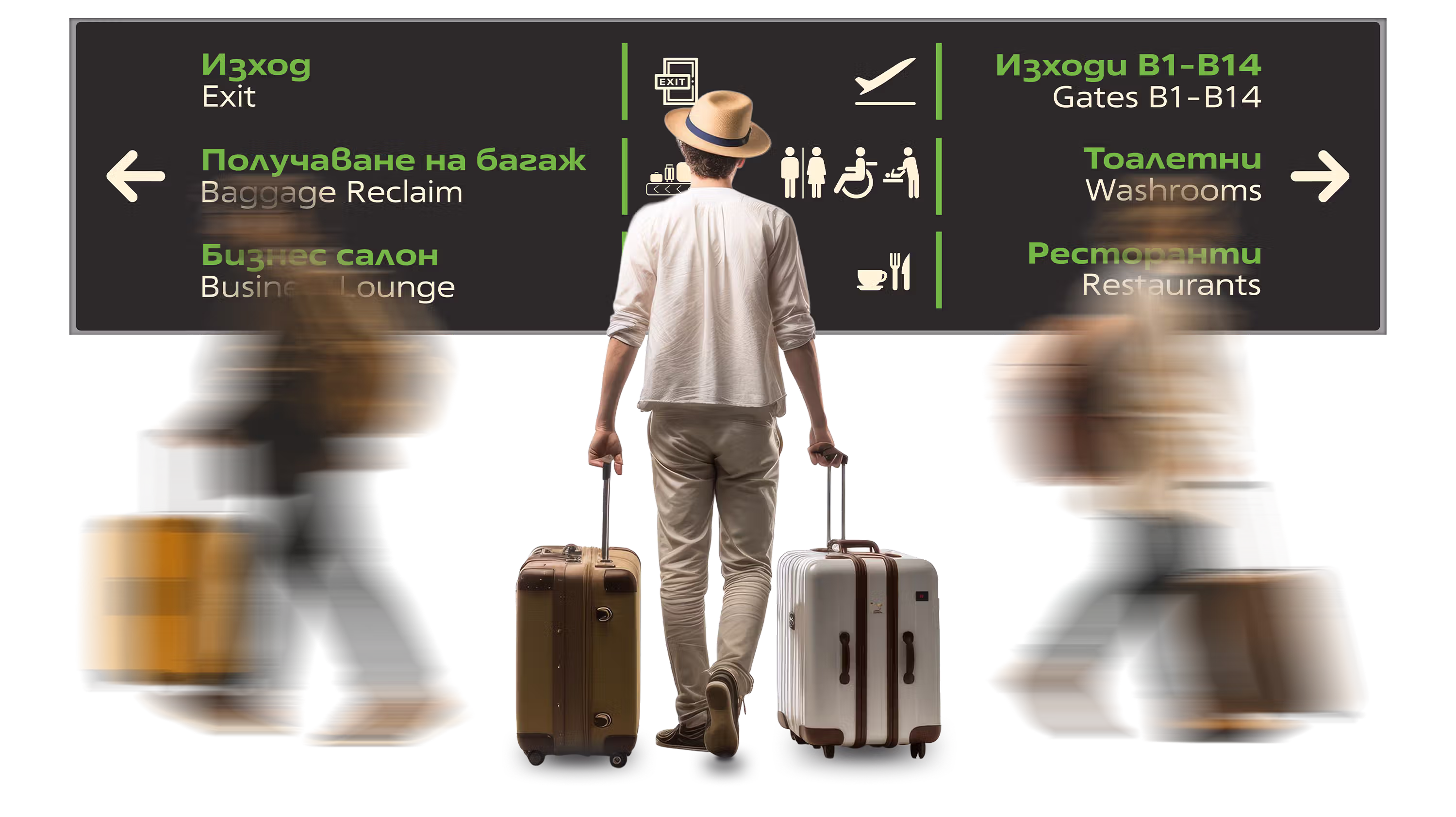
Layout Variants for Every Context
One system that adapts to every screen type and location.
• Departures and Arrivals for landside, airside, and VIP zones
• Horizontal and vertical layouts with consistent logic
• Consistent grid so passengers relearn nothing between screens
Why it matters: Reduces cognitive load across the terminal network.
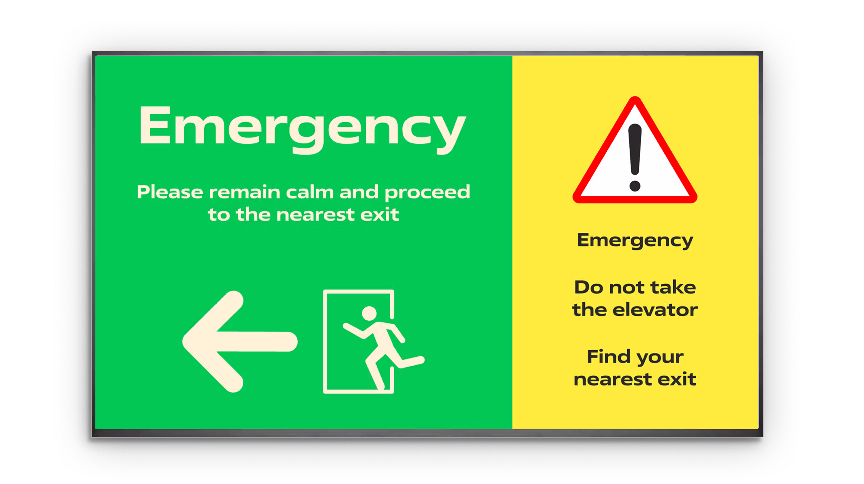
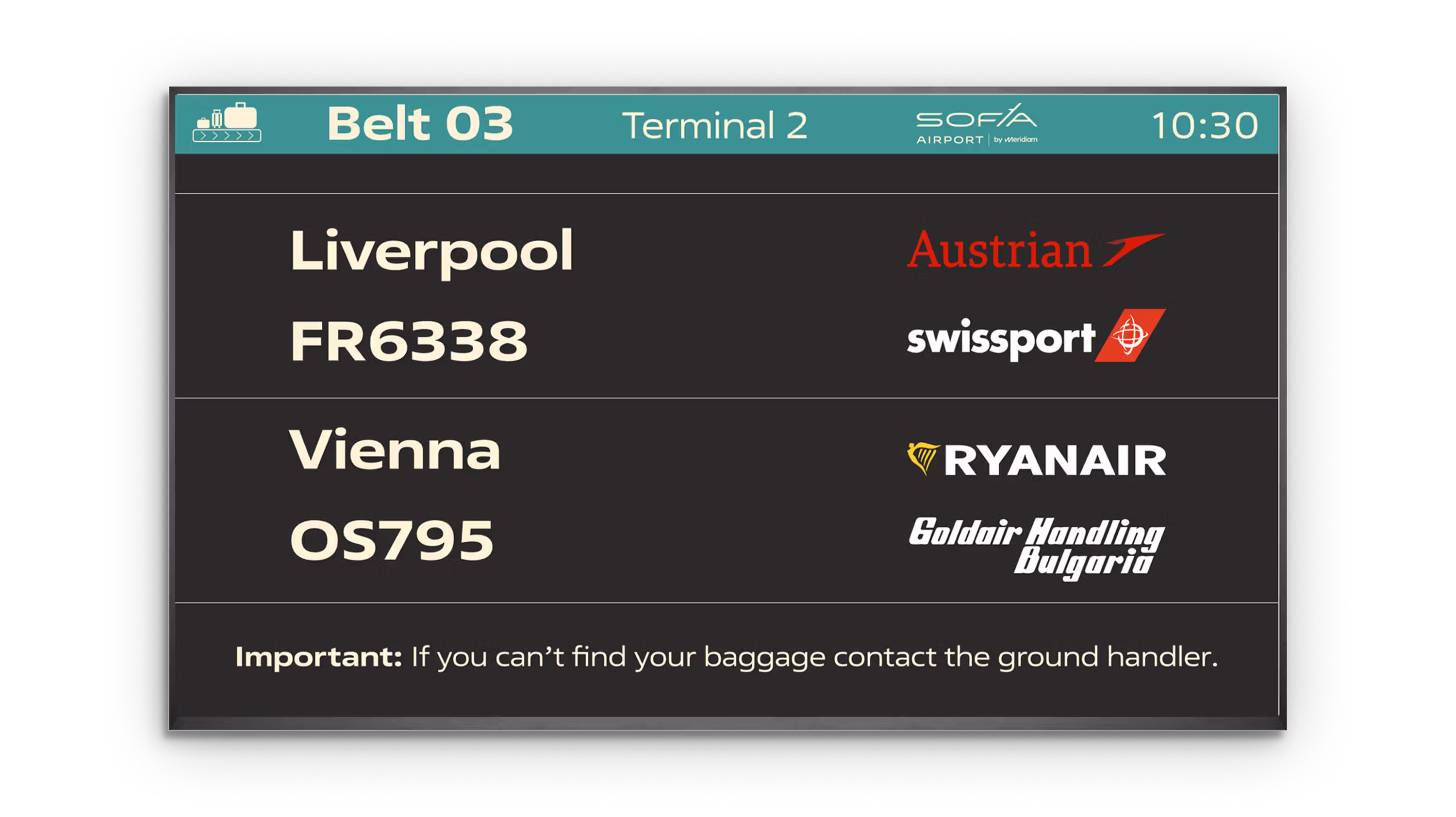
Disruption-Ready Patterns
Designed to stay clear when operations change fast.
• Handles delays, cancellations, gate changes, and split listings
• Keeps priority info stable while rows update in real time
• Supports announcements, notices, and emergency states
Why it matters: Keeps flows moving when the airport is under stress.
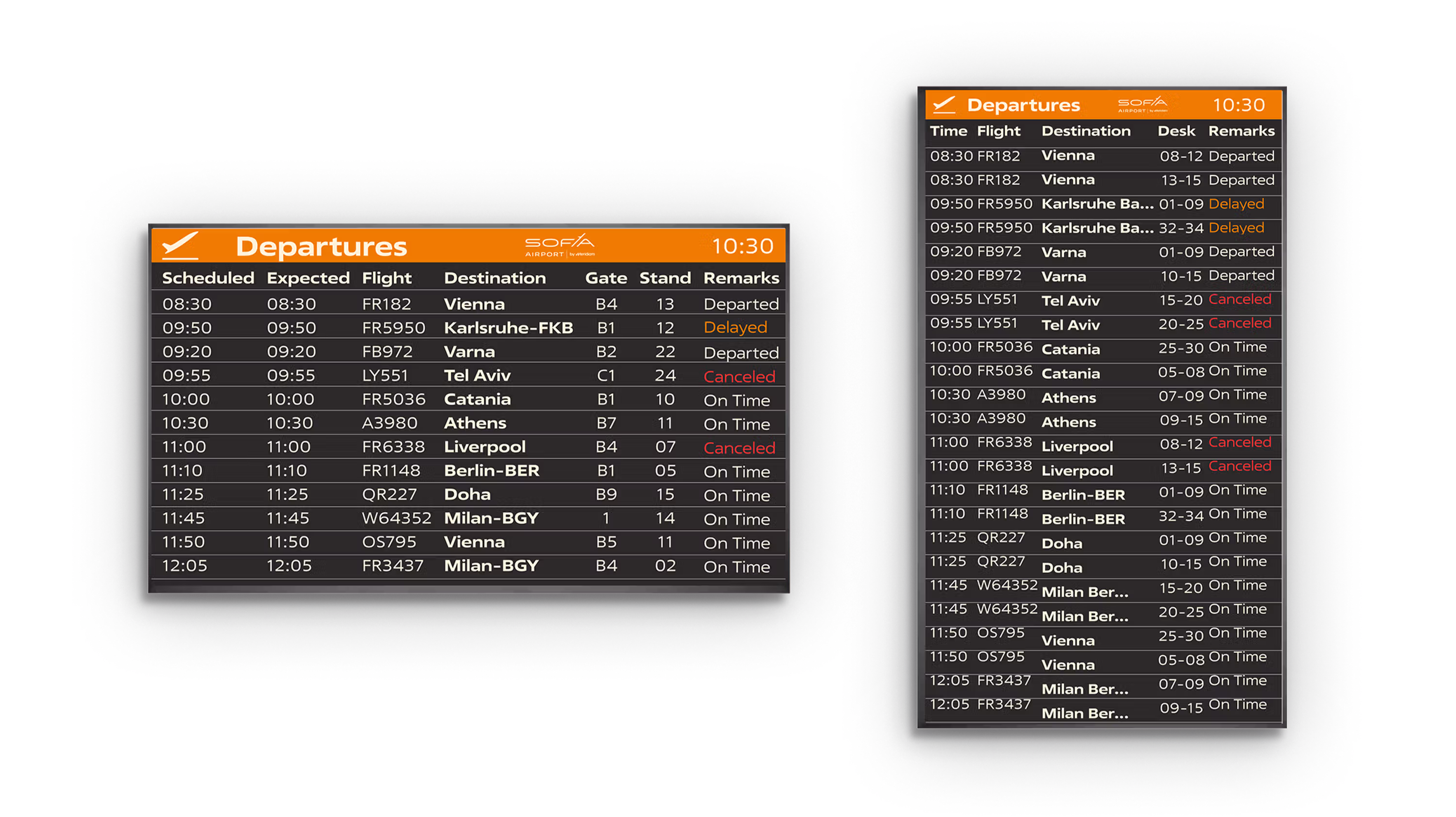
Scalable Template System
A structured UI system that stays consistent as content grows.
• Component rules for headers, rows, dividers, and alerts
• Naming and layout standards for future screens and variants
• Safe for localization and mixed data quality
Why it matters: Prevents drift and keeps the network coherent over time.
Passenger Intent is Urgent
Airport passengers do not “explore”. They scan, decide, and move. Most checks happen under time pressure, often while walking, pulling luggage, or tracking a gate change. The system is designed to reduce hesitation by surfacing the few fields that matter now, keeping rows readable at a glance, and maintaining a stable rhythm that stays familiar even when the data changes.
Constraints
This redesign had to respect real operational constraints. It needed to work across multiple screen sizes and locations, handle frequent updates without visual noise, and remain accessible and legible from distance. The UI also had to accommodate multiple languages, airline and handler branding, and edge cases like disruptions, repeat flights, and next day schedules. The result is a flexible template system that stays consistent while adapting to context.
Need an operational UX system that stays clear as things change?
I help teams reduce friction across high-intent journeys through task-first IA, scalable templates, and measurable outcomes.
More Case Studies
Sofia Airport Wayfinding Redesign
A strategic wayfinding system built for Schengen compliance, accessibility, and measurable passenger outcomes.
View case study

Sofia Airport Website
Rebuilt IA and task-first journeys. Unified templates for scalable updates.
View case study
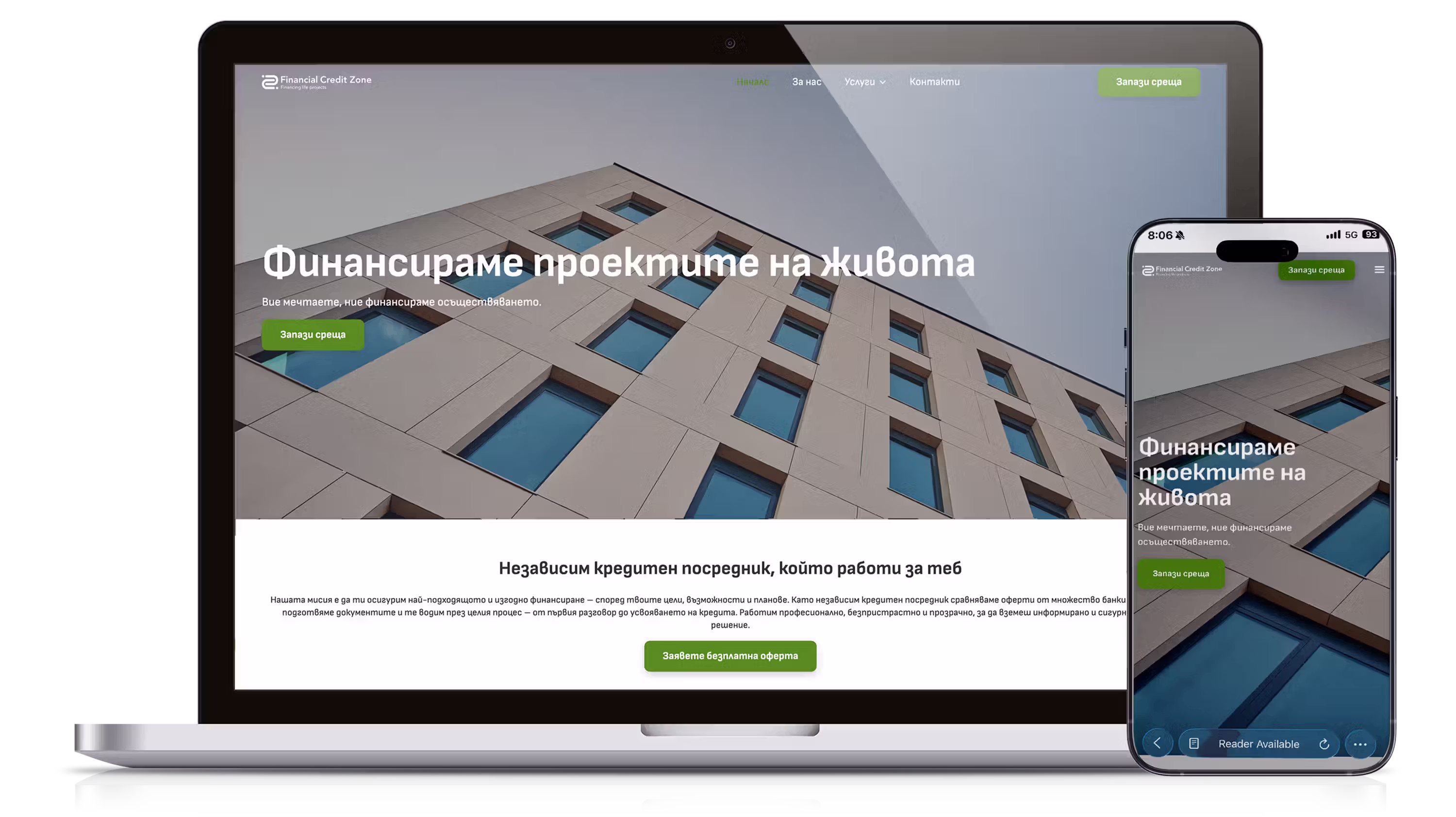
FCZone Website
Built brand, IA, and calculators with real-world fee logic.
View case study
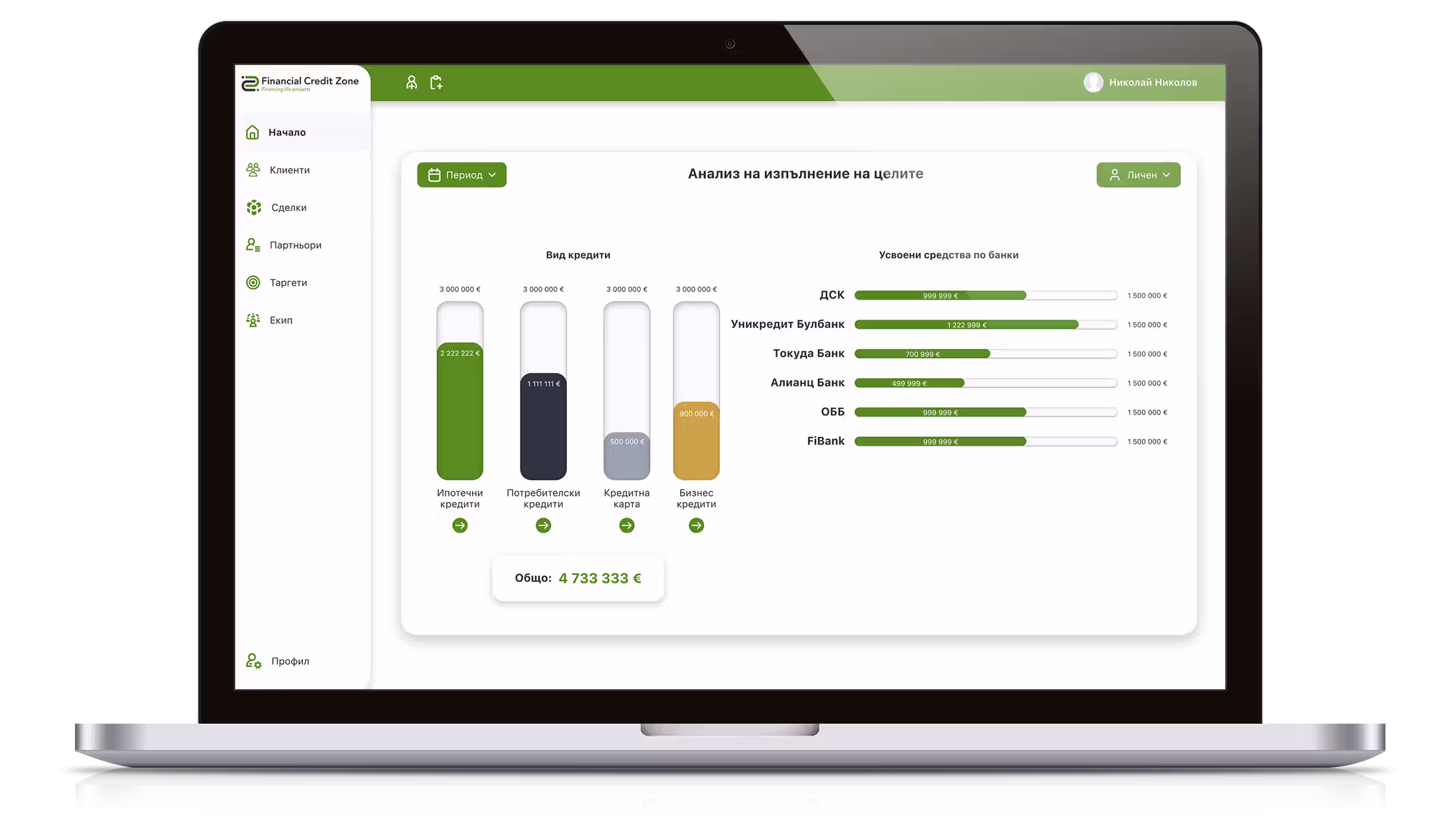
FCZone Custom CRM
Designed an automation-ready workflow that captures data once and stays traceable.
View case study
Strategic Product Design for high-stakes digital systems - UX/UI, IA & Webflow execution.


© Churkov, 2026