


Sofia Airport
Aviation Training Center
Booking Platform
I designed the product logic, booking architecture and admin workflows for Sofia Airport's first self-service training platform. Date-driven inventory and conditional states replaced manual coordination.

Product design
Information architecture
Operational UX
Role: Lead UX/UI & Product Designer
Timeline: Ongoing, several iterations
Tools used:

Figma

Illustrator

Photoshop

Teams
A move from email and phone calls to self-service booking, designed within real CMS limits for an operations team that doesn't code, right after ACI accreditation raised the bar.
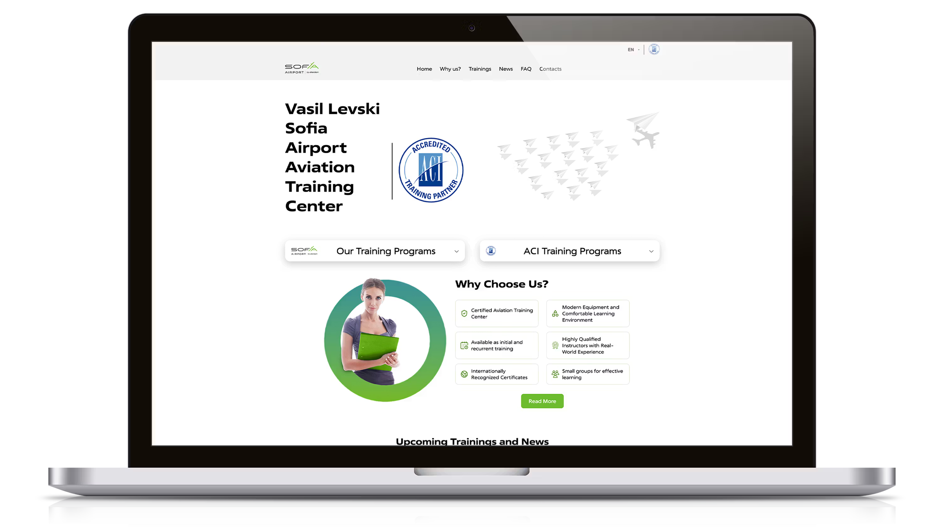
At a glance
Sofia Airport's Aviation Training Center had just earned ACI international accreditation. That brought outside demand, regulatory rigor and a clear problem: no digital system to support it. Courses were arranged by email and phone. Dates lived offline. When a session was full, people hit a dead end.
CHALLENGE
No scheduling logic, no seat tracking, no self-service. Course information was scattered across pages and offline lists. Every full course meant manual follow-up on every inquiry. After accreditation the center was expected to serve international participants, on infrastructure that wasn't digital yet.
APPROACH
I owned the whole experience: the information architecture, dynamic course components, capacity states, request-a-date scheduling, the booking flow and a detailed backend specification for the developers. I worked with them directly to fit the product logic to the CMS.
RESULT
A dedicated booking platform with date-driven course inventory, conditional states, card payment and a fallback that captures demand when sessions sell out. It replaced manual coordination, and the operations team runs it without developer support.
CREDIBILITY
Executive leadership recognized the platform for its clarity and structure, and the Chief HR Officer praised its quality. The Head of the Aviation Training Center publicly credited me by name. SOF Connect promoted the platform publicly, and it drew independent professional praise.
STAKEHOLDER VALIDATION
“Gancho played a key role in shaping the Aviation Training Center’s digital experience beyond the level of a standard website project. He approached it as a true product design challenge: rethinking the user journey, clarifying the information architecture, and creating a much more functional and scalable system for course discovery, registration, and administration. His work helped transform a static page into a structured platform that better serves both users and our internal teams.”

Anelia Dimova
Chief HR Officer, SOF Connect · Operator of Vasil Levski Sofia Airport
OPERATIONAL CONTEXT
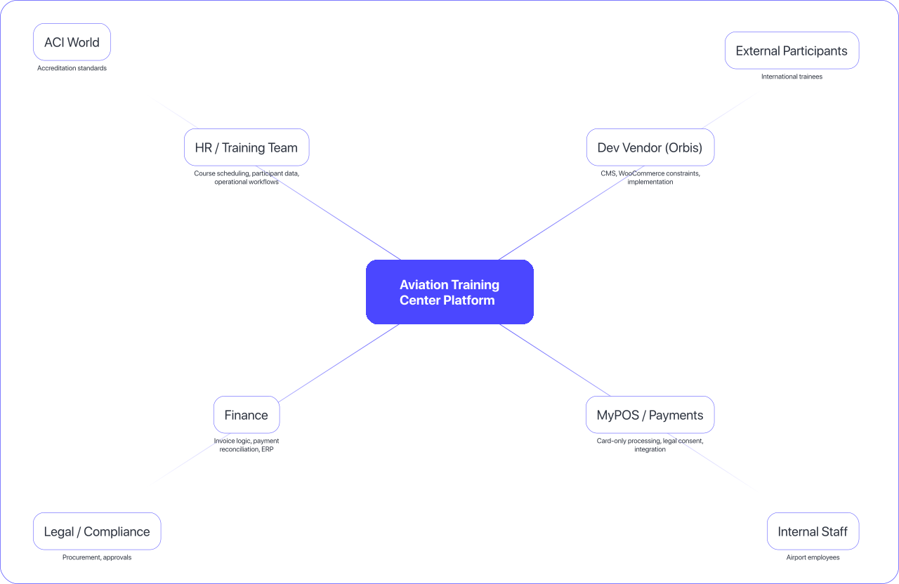
Many teams behind one interface
The platform had to serve and coordinate HR, Finance, Development, Payments and Legal, and meet ACI accreditation requirements, all at once.
What shipped
Clear information architecture
A course structure built for discovery, scheduling and registration.
• Separated courses into two main categories: internal trainings and ACI-accredited trainings
• Subcategories for initial and recurrent certification
• Clear navigation paths from browsing to booking
• A hierarchy that lets admins grow the catalog on their own
The structure decides how people find courses, how courses relate, and how admins add new ones without rebuilding the site.
Course cards that change with the date
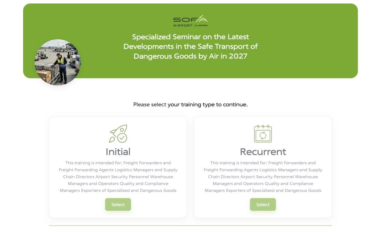
Pick a date and the seats, price and course type update with it.
• Choose an upcoming date right on the card
• The card shows available seats, maximum participants, course type and price
• Many dates under one course, with no duplicate pages
• A full date changes the button (see the next feature)
Training runs on dates, like events. One course runs on different days with different capacity, so the card had to follow the date.
When a course is full
No seats left? “Apply now” becomes “Request a date”.
• At zero seats the button switches on its own
• No buttons that lead nowhere
• Two states per card, driven by live inventory
• Sold-out courses stay visible and collect interest instead of disappearing
The button follows a rule: when inventory reaches zero, people are routed to leave their interest.
Request a date
A fallback that captures demand and sends it to the admin team automatically.
• A short form, already filled in with the course name, appears when no dates are open
• Captures: first name, last name, email, phone
• On submit: a confirmation to the person, and a demand signal emailed to the admin
• Operations can schedule around real demand
Dead ends became leads. Interest in a full course now reaches operations as a reason to schedule another date.
Application and payment
Registration from start to finish, with card payment, legal consent and an automatic note to the admin.
• The full journey: choose a course → apply → pay → confirmation
• Card-only payment through myPOS, a compliance requirement
• Mandatory legal consent checkbox aligned with payment provider requirements
• Trainee data and payment confirmation go straight to the admin, with no retyping
Payment had to meet compliance rules (card only) and operational ones (admin handled by email), and still be simple enough for a team that doesn't code.
Inventory the admins control
A per-date inventory module, so operations is in full control without a developer.
• Each course date has its own inventory record in the admin panel
• Admins manage seats, date details, active or inactive status and course variants
• Every data field (static or dynamic), interaction and notification trigger defined
• Detailed development specification covering the full journey from the admin's perspective
The admin team needed to add dates, adjust seats and toggle visibility on their own, without filing a ticket. I specified exactly how the admin side behaves, so the developers could build to a clear contract.
Booking logic is operations logic
Booking a training course is an operations problem more than a shopping one. Seats are limited by classroom size and regulation. Dates move. Courses differ between initial and recurrent certification. The admin team, spread across HR, the Training Center, Finance and outside vendors, handles everything through CMS dashboards and email.
The design had to respect that. Every state, form, fallback and notification was shaped around what the team could actually sustain. I designed for two people at once: the person browsing and booking a course, and the administrator receiving and processing applications on the other side.
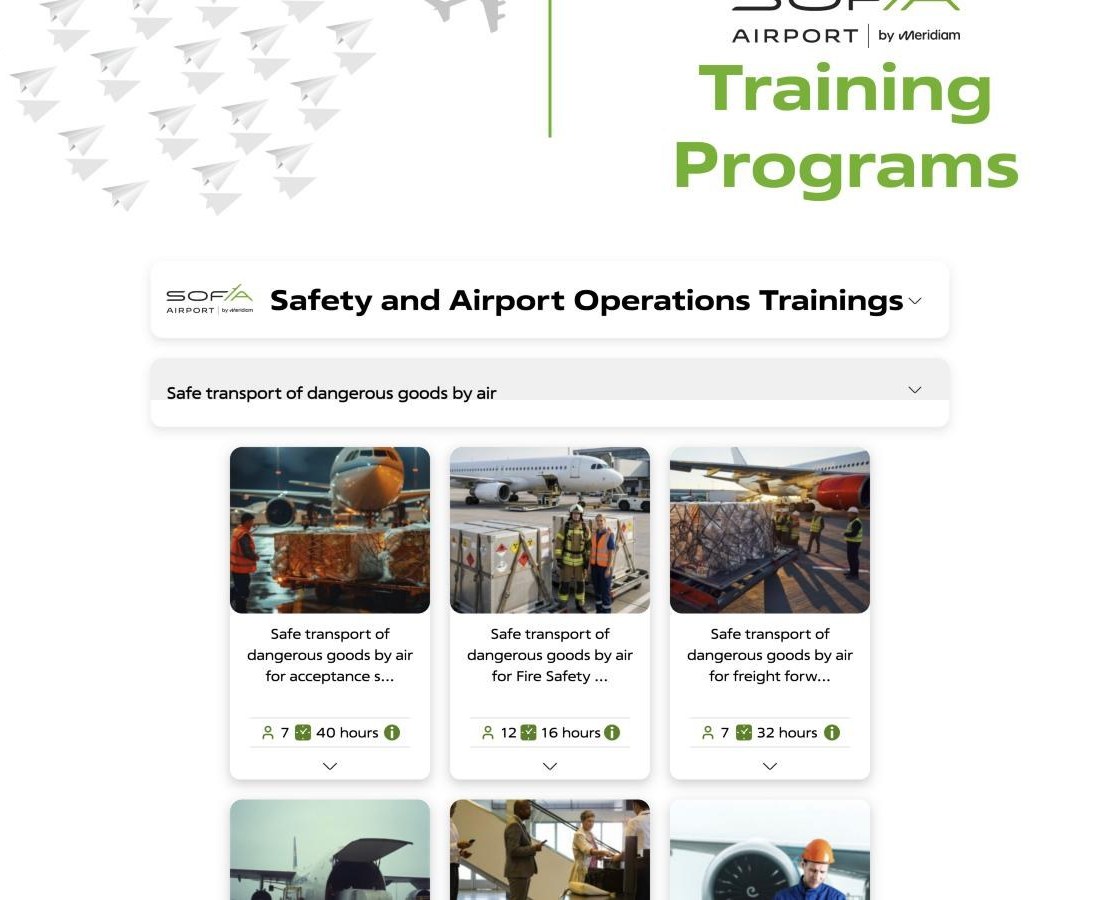
Live platform
In production today
Screens from the public booking site. A course type switches off on its own when no dates are open, and the visitor can request a date instead.
Visit training.sofia-airport.eu ›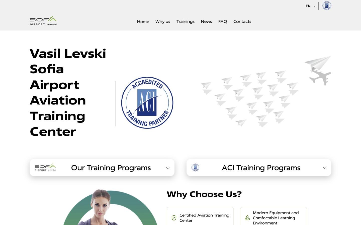
Have a booking or operations flow that runs on email and spreadsheets?
I design the product logic, states and admin workflows that turn manual coordination into a system a non-technical team can run on its own.
More work

Sofia Airport Wayfinding
Signage for Schengen routing and accessibility that ranked #1 in Europe.
View case study

Sofia Airport Website
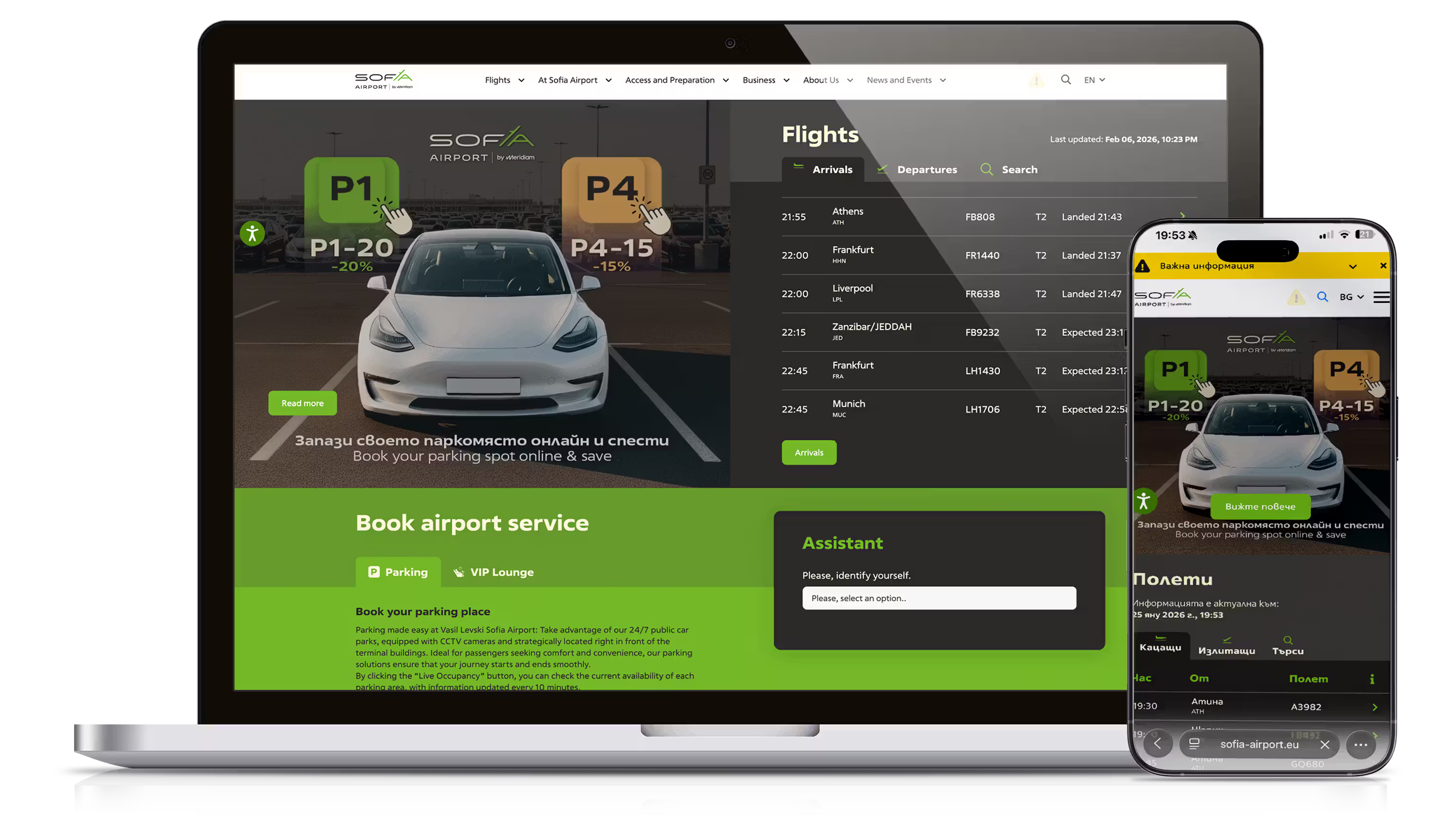
Task-first structure and shared templates for a site that keeps changing.
View case study
FCZone Website
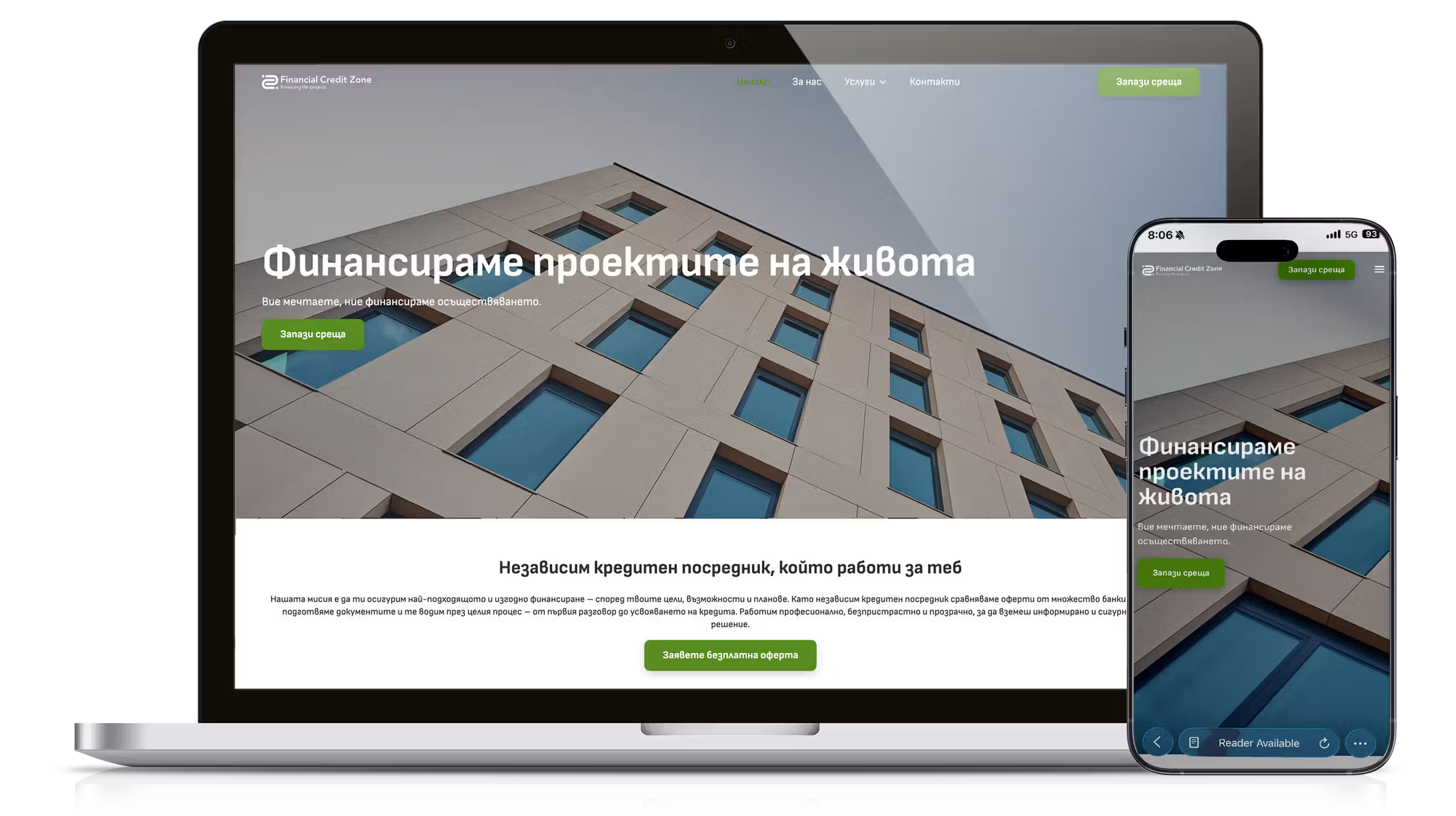
Brand, structure and calculators with real-world fee logic.
View case study
Sofia Airport FIDS
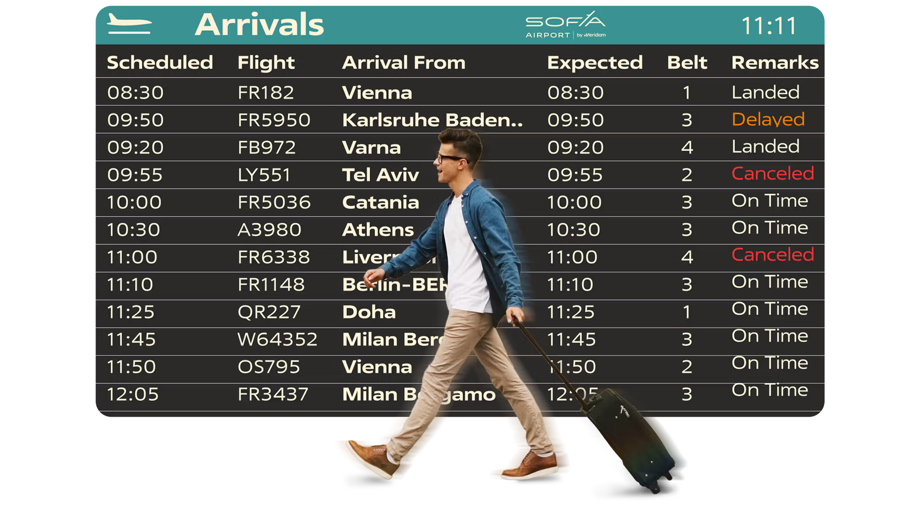
Flight screens designed to be read at a distance and at speed.
View case study
Wayfinding, operational UX and digital product design for high-stakes systems.


© Churkov, 2026